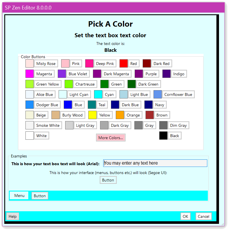
This Dragon–friendly SP Color Picker dialog allows the user to make changes to some of Speech Productivity© modules’ text box and interface — both background and text colors.
| The Usage Configurations |
| The Common Colors Buttons |
| The More Colors Button |
| The Examples |
| The Buttons At The Bottom |
| The “Known” Colors |
The Four Configurations
The SP Color Picker dialog can be seen in four configurations: changing the text color of the text field, changing the background color of the text field, changing the text color of the interface (menus, buttons etc.) and changing the background color of the interface. Other than the second and third lines of each dialog (which only differ in describing whether the dialog is going to affect the text box or interface colors) these configurations are visually identical:
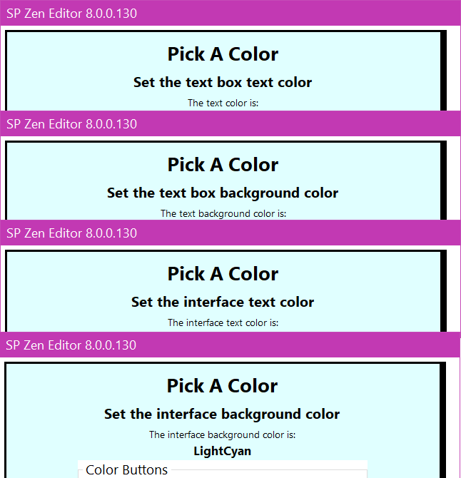
The second line identifies the usage (text color, text background color, interface text color and interface background color).
The third and forth lines identify the color’s name (from the list of over 160 known colors).
The Common Colors Buttons
Below these lines is an array of thirty-five buttons representing popular common colors.
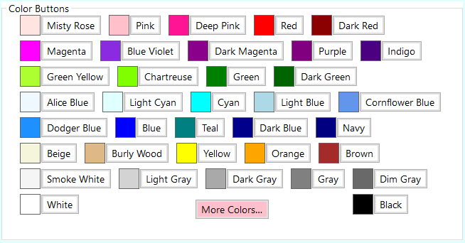
This gives immediate access to thirty-five specific colors which might be well suited for use in an editor’s GUI. Below is a better representation of what these colors might look like on your monitor.
| Misty Rose | Pink | Deep Pink | Red | Dark Red | |||||||||
| Magenta | Blue Violet | Dark Magenta | Purple | Indigo | |||||||||
| Green Yellow | Chartreuse | Green | Dark Green | ||||||||||
| Alice Blue | Light Cyan | Cyan | Light Blue | Cornflower Blue | |||||||||
| Dodger Blue | Blue | Teal | Dark Blue | Navy | |||||||||
| Beige | Burly Wood | Yellow | Orange | Brown | |||||||||
| White | White Smoke | Light Gray | Dark Gray | Gray | Dim Gray | Black |
The More Colors Button
Below these common color buttons, on a line by itself, is the More Colors… button. The More Colors… button opens a dialog which is a separate application. More detailed instructions may be found here.
This dialog is completely Dragon–friendly. To choose any of the many “known colors” just say “click” followed by the name of the color (it is even easier if you have the Dragon option to “Require Click” turned off — then you may just say the name of the color). Picking a color automatically dismisses the dialog and sends the chosen color back to the SP Color Picker dialog. The new choice will immediately be displayed in the current color description and the color example field will change to reflect this new choice.
There are more details about the “known colors” here.
The Examples: Textbox, Menu And Buttons
There are four examples: one is a text box which represents how your text will look in the editor; another is a non-functional menu; there are also a two non-functional buttons.
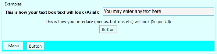
The text example box is a text field which displays text (it starts out with the general “You may enter any text here” string but anything may be typed there). This text will be displayed with the currently chosen text color printed on the currently chosen background color. These colors will change dynamically with common color button clicks or as the result of a successful choice from the external color picker dialog.
The interface color examples (menu and button) are displayed with the currently chosen interface colors (font color and background color). These colors will change dynamically with common color button clicks or as the result of a successful choice from the external color picker dialog.
Any text may be entered here. This box will remember its contents until the Speech Productivity© module closes.
While these demonstration items are conceptually functional they perform no real functions.
The Buttons At The Bottom
At the very bottom of the dialog are three buttons: Help…, OK and Cancel. The “Help…” button opens up this help HTML page in your preferred browser; the “OK” button registers your preferred color choice for the intended usage and closes this dialog; the “Cancel” button closes the dialog ignoring any color choices you may have made.

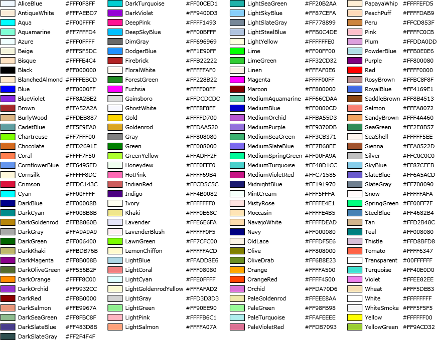
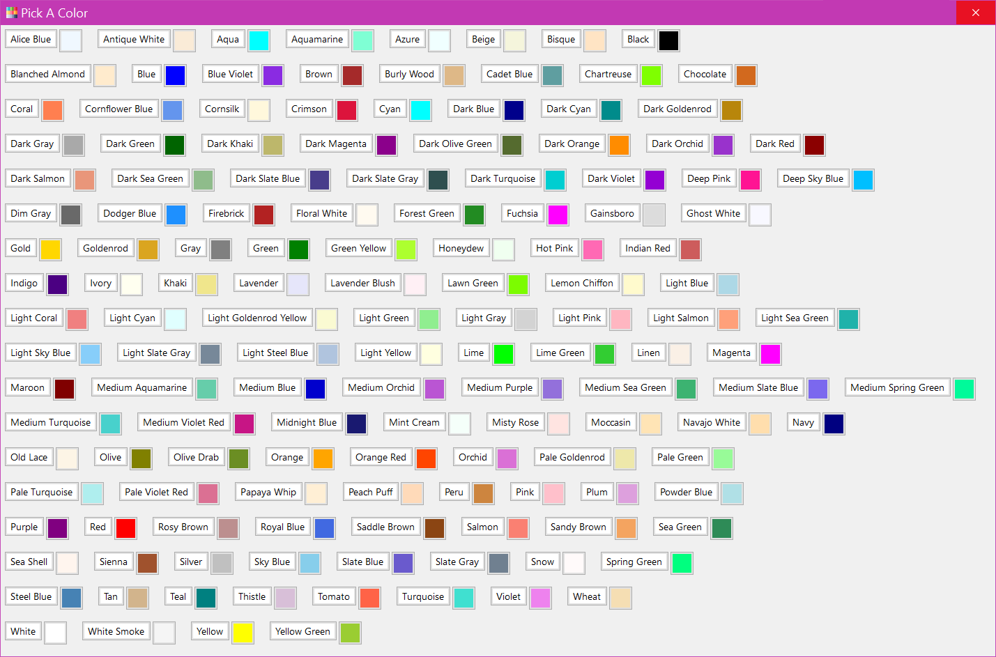
The “Known” Colors
The list of “known” colors includes over 160 colors and is defined by Microsoft. Some of these colors have been chosen to work especially well on Windows and its widgets. Some of these colors are especially well suited for use in web browsers. If Windows adds new colors in the future they will automatically be added to Speech Productivity©”s External Color Picker dialog when Windows updates.